After prototyping a mobile app using Bolt. Newly, I wanted to explore how far I could push the tool — this time for web design.
My question: Would the same approach still work? Could a well-crafted prompt alone outperform a visual reference?
Instead of relying on a UI screenshot to guide the result, I decided to focus on feeding Bolt a strong, structured prompt and see how close it could get to a real, usable landing page.
I still used an image to kick things off — browsing Framer templates and picking one that matched the kind of layout I wanted. But instead of uploading that image directly to Bolt, I sent it through ChatGPT and asked it to turn the design into a detailed prompt optimized for Bolt.new.
It returned something impressively close to a dev-ready structure — with defined sections, copy ideas, and even some hierarchy logic.
Here’s a snippet:
“Design a dark-themed, modern SaaS landing page for an AI automation service called ‘Sintra’.
Include: hero section with headline and CTAs, trusted by logos, 4 features, 3-step process, impact metrics, testimonials, pricing, FAQ, and final CTA.
Style: sleek dark mode, clean layout, soft purple accents.”
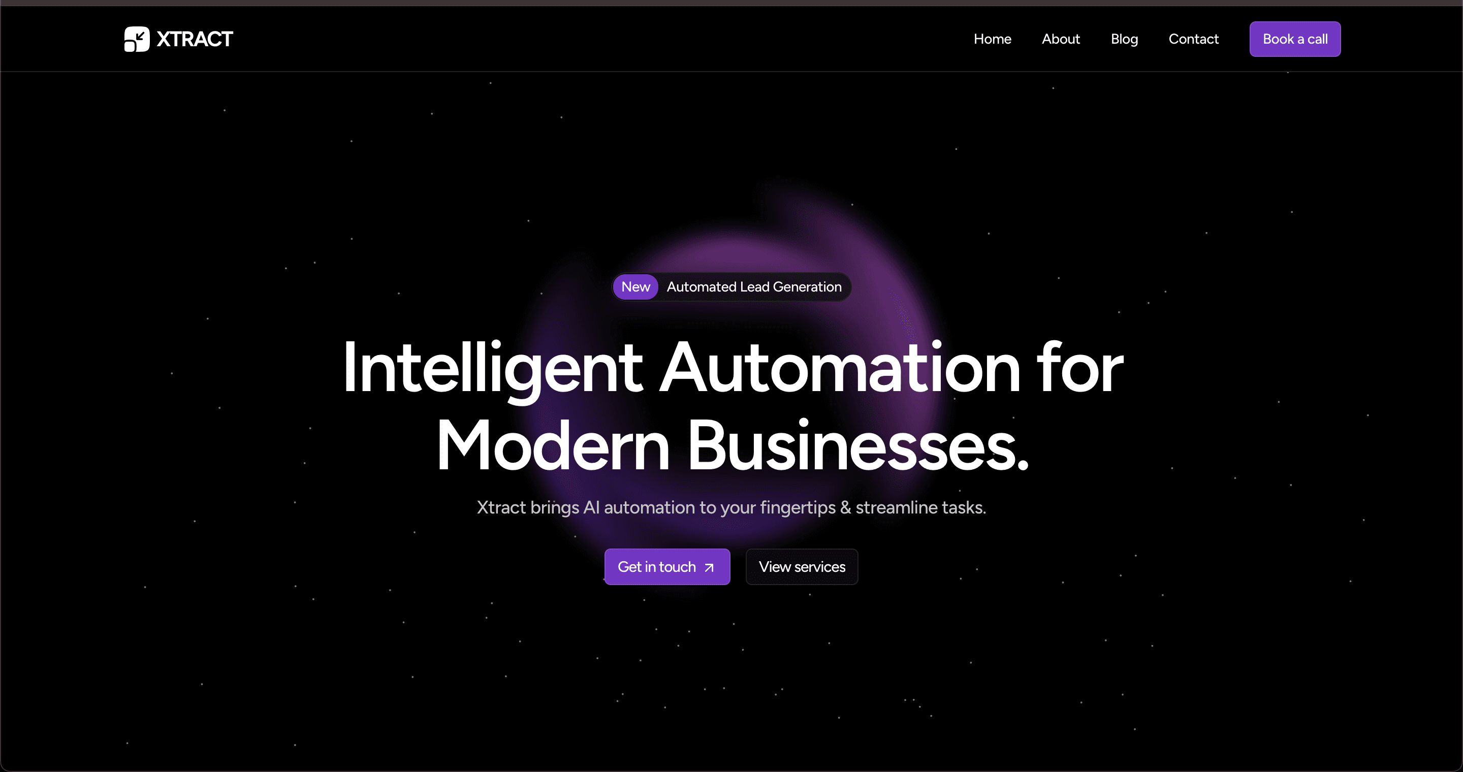
Image reference: Template from xtract.framer.ai
I pasted the full prompt into Bolt and got a landing page almost instantly. Within seconds, I was tapping through a working mockup with screen transitions and interactive CTAs — no code required.
The design felt a bit basic, but it wasn’t bad. And it’s easy to build on top of it by simply continuing the conversation inside Bolt’s own AI chat.
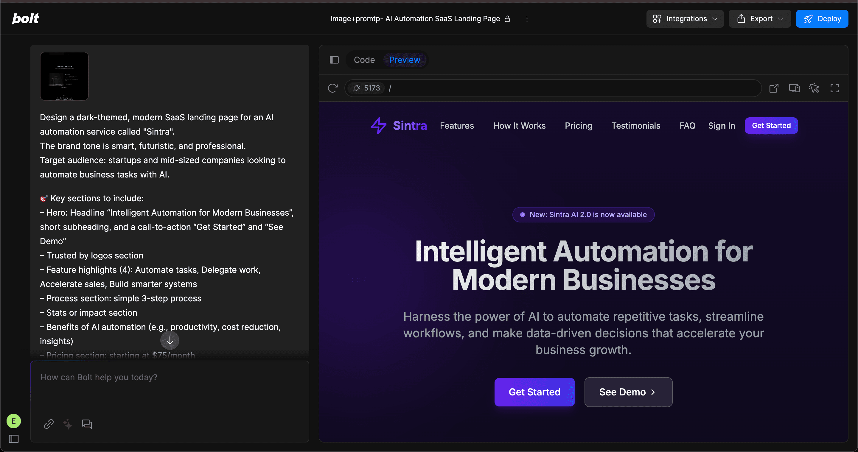
As shown in the video, most CTAs were tappable — Bolt didn’t just generate static screens, it built a semi-functional prototype with basic interactions. While it didn’t perfectly match the reference image, the overall style aligned with what I had in mind. I would’ve liked more interactivity on some elements, but for a single text + image prompt, the result was more than solid.
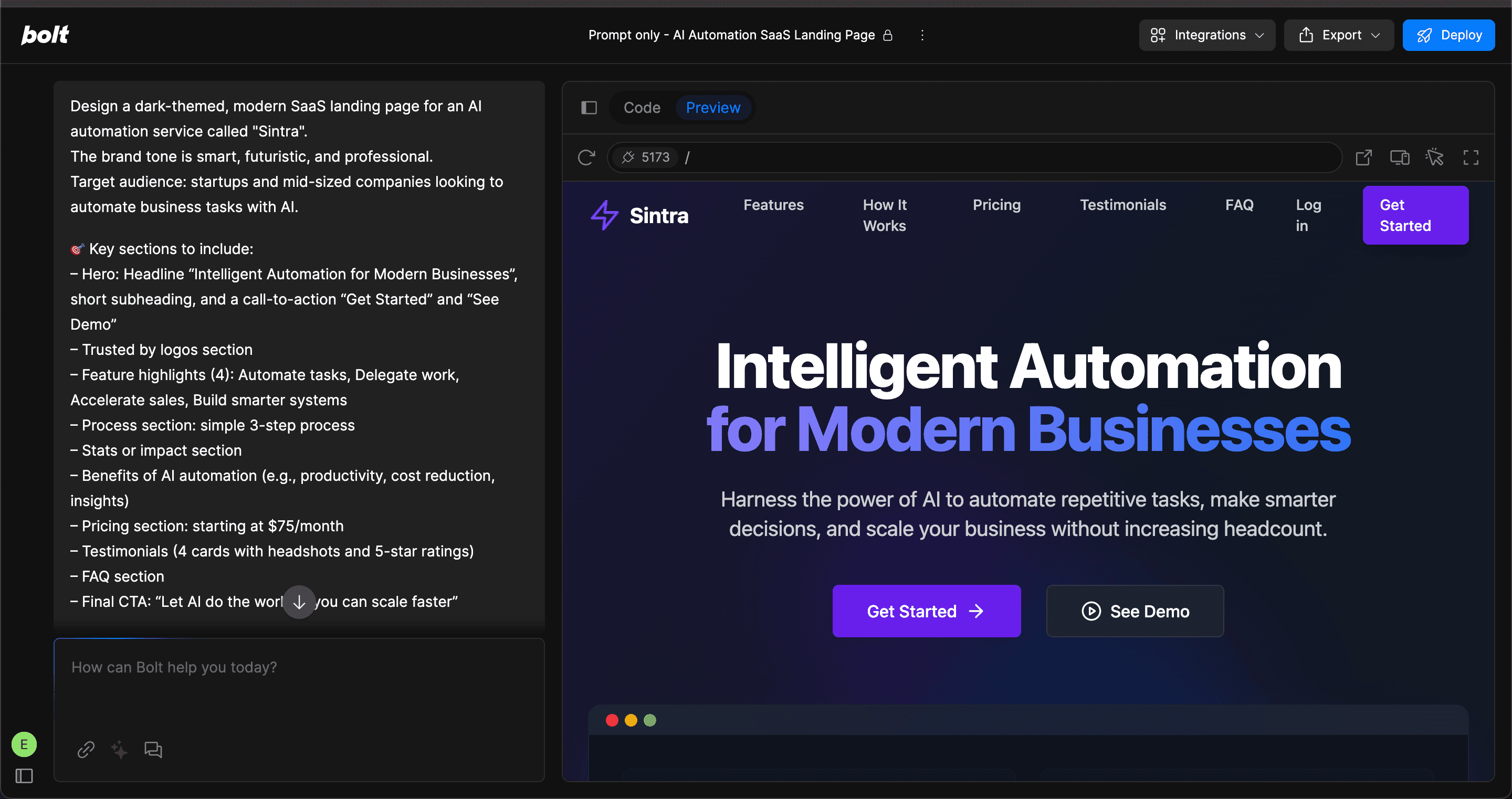
After testing Bolt, new with a combined input (text + image), I reran the same experiment, but this time using only the text prompt I had extracted earlier from the image.
To my surprise, the result felt even stronger. The UI Bolt generated was more detailed, with extra touches that made the prototype feel more dynamic. There were more tappable actions, better spacing, and the flow between screens felt more intentional, even though I hadn’t provided any visual reference this time.
Prompt:
Design a dark-themed, modern SaaS landing page for an AI automation service called "Sintra". The brand tone is smart, futuristic, and professional.
Target audience: startups and mid-sized companies looking to automate business tasks with AI.
🎯 Key sections to include:
– Hero: Headline “Intelligent Automation for Modern Businesses”, short subheading, and a call-to-action “Get Started” and “See Demo”
– Trusted by logos section
– Feature highlights (4): Automate tasks, Delegate work, Accelerate sales, Build smarter systems
– Process section: simple 3-step process
– Stats or impact section
– Benefits of AI automation (e.g., productivity, cost reduction, insights)
– Pricing section: starting at $75/month
– Testimonials (4 cards with headshots and 5-star ratings)
– FAQ section
– Final CTA: “Let AI do the work so you can scale faster”
💡 Style: sleek, dark mode, clean layout, soft purple accents
Layout: vertical scroll, centered content, strong typography
As shown in the video, most CTAs were tappable — Bolt didn’t just generate static screens, it built a semi-functional prototype with basic interactions. While it didn’t perfectly match the reference image, the overall style aligned with what I had in mind. I would’ve liked more interactivity on some elements, but for a single text + image prompt, the result was more than solid.
Bolt.new feels like a supercharged playground for early concepting. The speed, fidelity, and ability to simulate flow and structure without touching a design tool makes it a powerful option — especially for ecommerce or mobile UX ideas that rely on layout and product logic.
While it’s not a replacement for deep product design, it’s an impressive way to get from idea to interaction fast.