Design System
10 mins read
Design Strategy

Overview
Role: Lead Designer
When: 2024 - 2025
Platform: SaaS - Desktop
Industry: Sports, B2B
Responsibilities: UX Research, UI Audit, User Testing, Prototyping, Documentation
Key Deliverables:
UX Audit
User Flows
Wireframes & Prototypes
Style guide and tokenization
Components Library
Design System Documentation
About Fanatics
Fanatics is a global digital sports platform focused on serving fans throughout their entire sports journey. The company brings together commerce, collectibles, and betting under one ecosystem to deliver an integrated, personalized, and immersive fan experience.
With Fanatics Commerce, fans can gear up with officially licensed merchandise. Through Fanatics Collectibles, they can dive into the world of trading cards and memorabilia. And with Fanatics Betting & Gaming, they can engage with the sports they love in new and exciting ways.

Before images of the B2B platform
Challenge
Fanatics is a fast-growing company that is expanding through acquisitions and software development. This rapid growth fuels the business, but it also presents the challenge of integrating multiple platforms into a single ecosystem. In these processes, the need for quick adaptation can lead to inconsistencies in UI and design, as each platform has its structure and visual logic.
Defining the foundations is relatively straightforward, but the real challenge lies in achieving a common understanding and a unified design language that enhances collaboration and product consistency.
User needs
Managers and partners needed clear navigation, intuitive workflows, and easily digestible data presentation to build trust and drive adoption.
Adaptability
The platform had to be flexible enough to support different UX needs across various production areas.
Business goals
The main objective was to improve the scalability and operational efficiency of Factory Card through a well-defined design system. This would enable faster feature development, reduce redundancy, and enhance collaboration between designers and developers—ultimately leading to better user satisfaction and engagement.
My roles & Objetives
As Lead Designer at Fanatics Collectibles, my goal was to lead the transformation of their digital product experience and build a full end-to-end UX strategy to support the company’s fast-paced growth.
Key objectives included:
SaaS: Overhaul the user experience of both their web-based platforms.
Scalable Design System: Craft a comprehensive, component-based design system grounded in Atomic Design principles to streamline development, ensure consistency, and speed up iteration.
Enhanced UX: Elevate the overall user experience across all touchpoints, encouraging higher satisfaction, trust, and broader adoption of the FC platform.
End-to-end UX Strategy: Develop a holistic UX strategy to guide the design and evolution of Fanatics’ products, ensuring alignment with user needs, business goals, and the company’s larger mission.
Process
To build a scalable, consistent, and developer-friendly design system, I adopted a hybrid strategy that combined Figma Variables with Atomic Design principles and the Lean UX process.
Why this approach?
It gave us the flexibility to iterate quickly, validate with real users, and create a system that could grow and adapt—while keeping both design and development fully aligned.
Atomic Design for scalability
I used Atomic Design as the structural foundation—breaking down UI components into atoms, molecules, and organisms.
Tokenization with Figma Variables
We placed a strong focus on design tokenization using Figma Variables. These allow you to store and reuse values like color, spacing, typography, gradients, and visibility across your designs.
By combining traditional design token logic with the power of Figma Variables—Framework (April 2024)—we created a flexible system that could easily adapt to branding changes, theme variations, or platform-specific needs.
A shared language between design and development
This setup reduced handoff friction, eliminated guesswork, and helped build a shared language across teams. Figma Variables acted as a single source of truth that kept both the visual identity and the dev implementation in sync—accelerating delivery and boosting team confidence.

Process blending Lean UX with Atomic Design.
Solution
The FC Design System
Color styles with accessibility considerations built in, space, grid and breakpoint systems, and typography constituted the Foundations.
Atoms: Buttons, input fields, toggles, and switches were designed.
Molecules: Complex components like tables, cards, dashboard widgets, etc followed by organisms, templates, and pages.

Foundation color

Typography

Spacing

Tokens

Buttons

Inputs

Checkboxes - Radio Buttons and Switches
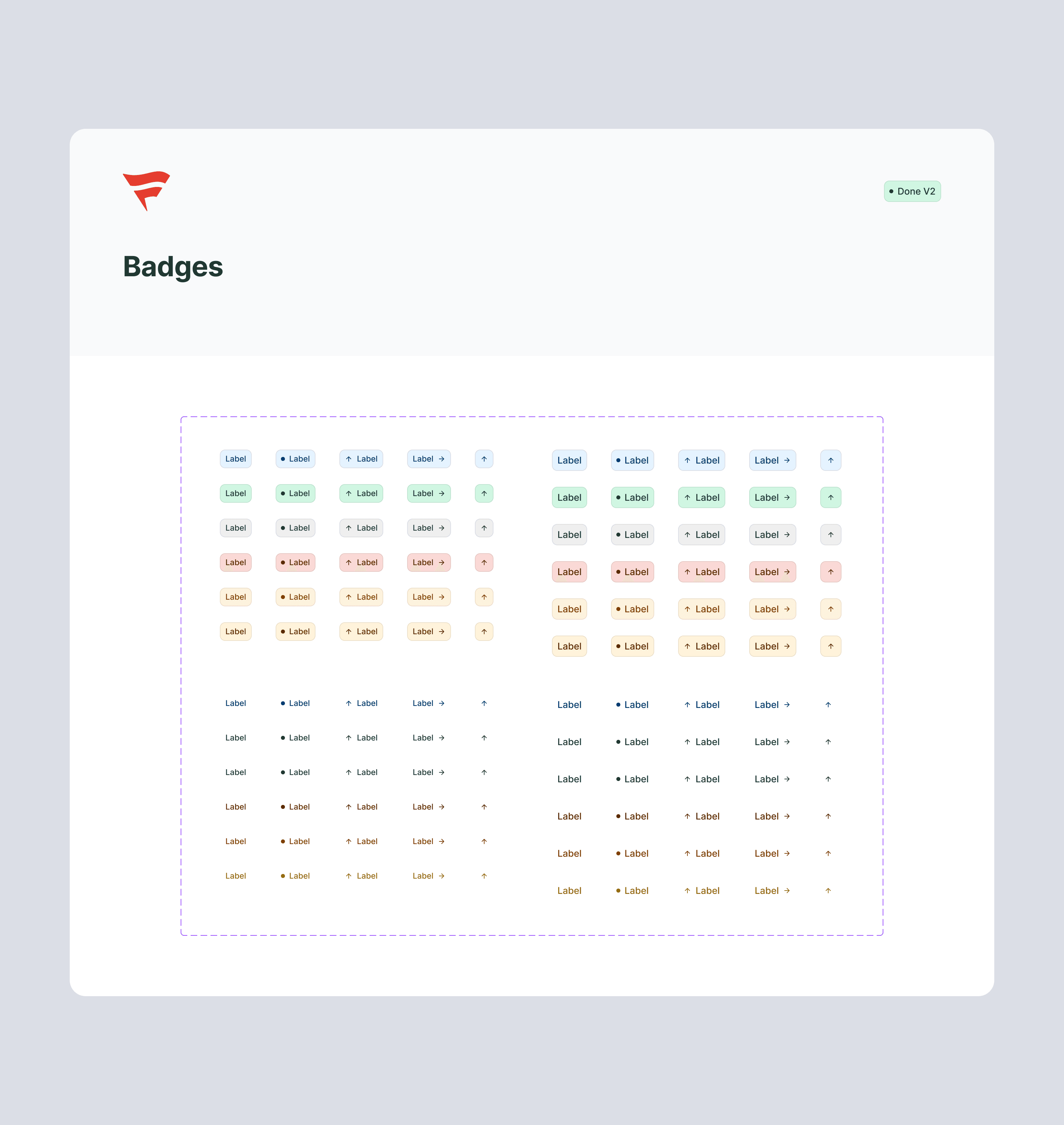
Badges

Tables [Header]

Tables [Items]

Tables [Frames] Organisms

Patterns
Documentation
I created detailed documentation for every component in the Figma Design System. It serves as a dev handoff guide and a best practices reference for designers, making it easier for everyone to design, build, and collaborate consistently.
On top of that, I built a centralized hub for design-to-dev handoff on Confluence, where all documentation, components, and guidelines live. It’s designed to support both designers and developers with a clear structure that’s regularly updated.
The hub includes:
– A full log of all components and their states
– Design guidelines and usage best practices
– Access info and onboarding steps
– Update tracking via Slack

Snapshot of the button docs in Figma—includes states, specs, and usage notes.
Impact & Conlusions
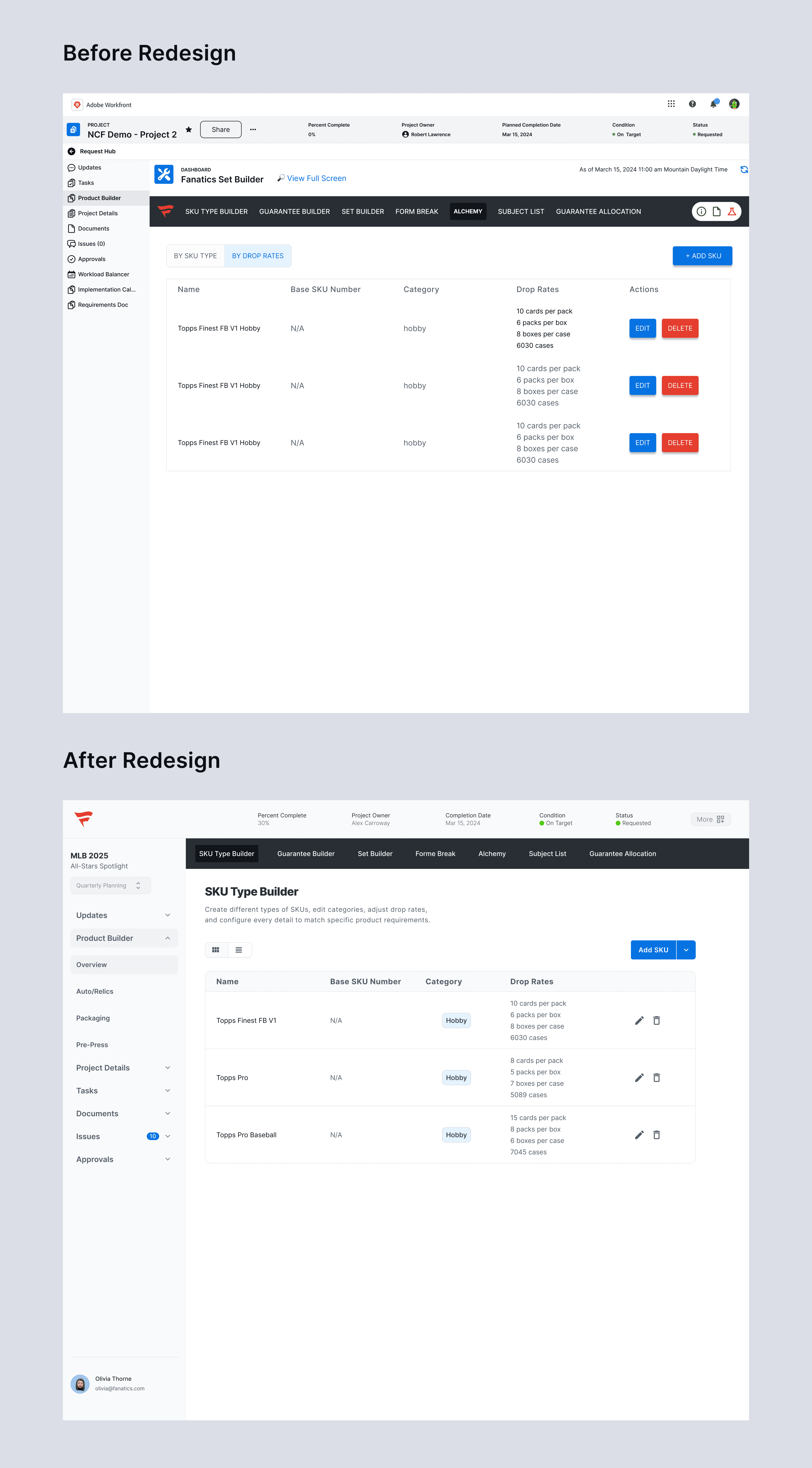
Comparison of before and after redesign desktop FC platform

Comparison of before and after redesign desktop FC platform


Redesigned dashboard with new Crop Tool
A streamlined update for Fanatics designers—featuring a new Crop Tool and improved UI states to speed up the creation of collectible cards.